AOF
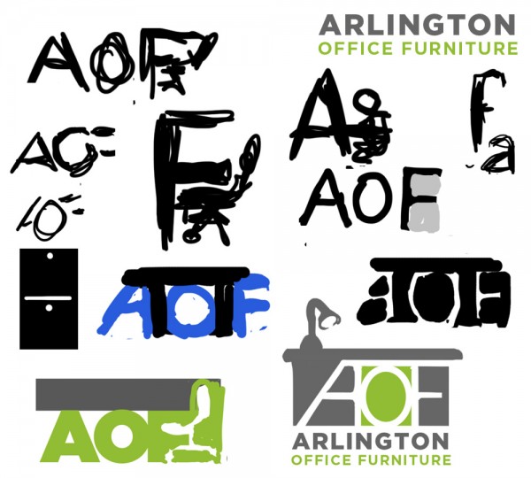
- A few of the rough doodles from the initial stages of the design process.
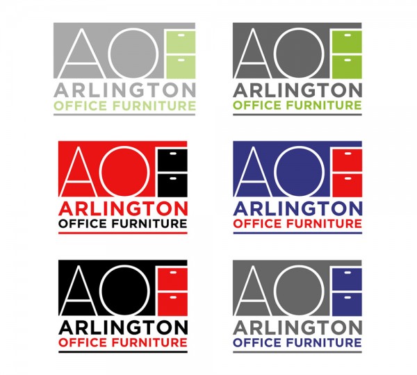
- Once the general design was worked out, the client wanted to see a number of specific color variations (as well as a slight change to the spacing, as shown.)
- This was the color scheme I initially developed, as applied to the final logo. (The client ended up asking for red and blue instead.)
Logo design for a retailer in Texas. The client had no solid pre-existing brand identity or clear concepts when we started – just a desire to refine and modernize their presentation.


